Hi guys! My name is Ariel and I’m the voice behind PMQ for two. I create bright, bold, colorful & creative interiors and DIYs. I love bold colors and patterns, so choosing rugs is simultaneously exciting and anxiety inducing, because I have a hard time narrowing down my choices. That being said, when Mohawk Home asked me to chose one for my studio’s dining area, I jumped at the opportunity!
How many of you own several rugs, all acquired over time with no rhyme or reason, and now you’re faced with the task of making them all work together? *quietly raises hand*
Well, you can actually fix the problem by buying another rug, it just has to be the right one.
In my case, I love patterns, and I already have many bold patterns in my studio. I knew I needed a rug under the oval table in the dining area, but I didn’t want to do a Persian pattern, and I knew I wanted something with color. This is where the PRISMATIC collection by Mohawk Home comes into play.
Mixing and matching patterns comes down to have a contrasting, but complimentary pattern, and from pulling colors from the existing space. I.e don’t bring new colors into the mix, and don’t zig if the original is a zag.
Pattern play is definitely easier with smaller items like pillows, blankets, and decor, but with rugs it’s a different ballgame. It takes up so much real estate in your space, that you need it to function as the anchor for the area.
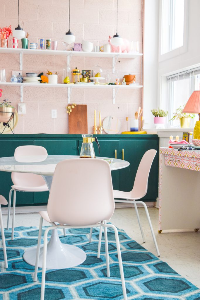

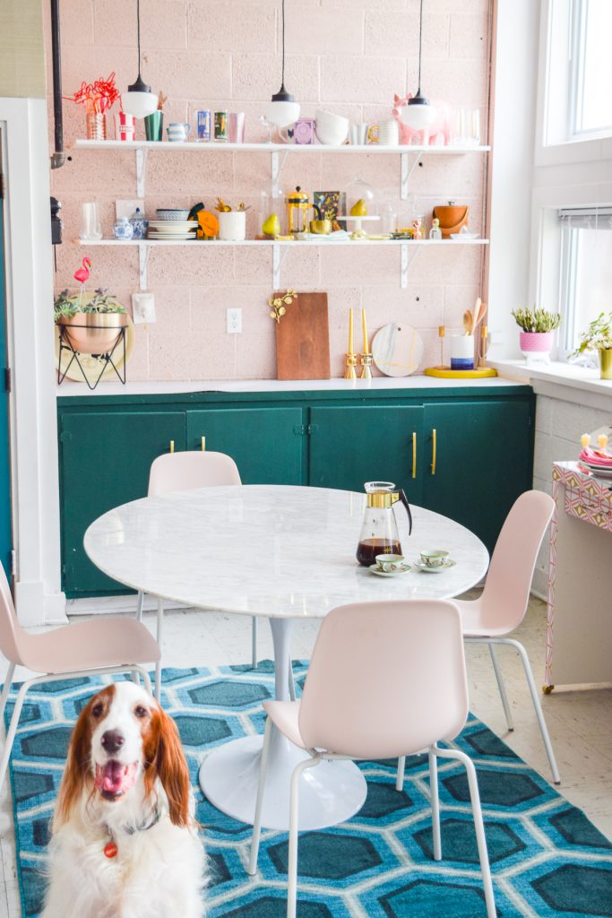
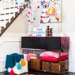
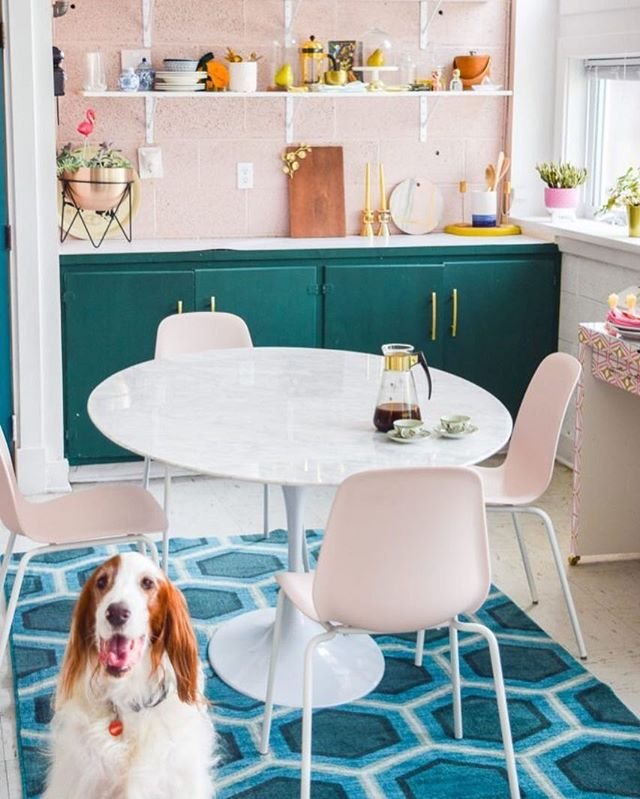
In the open concept studio, I already had the black & white gingham wool rug under the pink Indian bone inlay coffee table (a very eclectic look), and I needed to mesh it with a more bold and retro dining/kitchen area.
Thankfully we had a decisive dark greeny blue & pink palette in the space, so I could either match the rug to the pink or the greeny blue. The pink is too light to go underfoot, but the greeny blue was perfect.
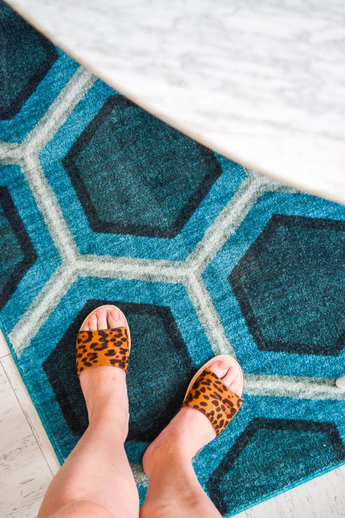
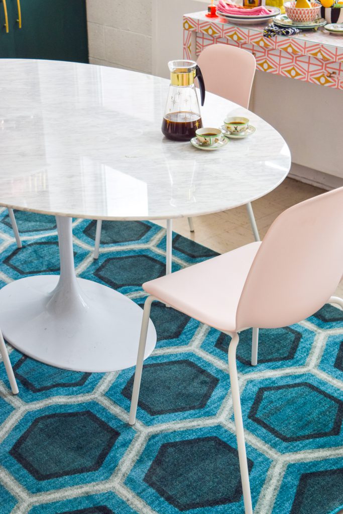
The Honeycomb Geo rug was the perfect match.
- It’s a geometric pattern, so it’s not too much of a clash with the plaid
- It pulls both shades of greeny blue already in the space
- It’s dark enough that it won’t show stains
- And the honeycomb pattern is reminiscent of retro wallpaper trends, which means it goes with the marble tulip table perfectly.
Now that I have it in the space, I can confirm that it does everything I wanted it to. It helps anchor the space, it provides a contrast to the flooring, and it ties-in with the existing plaid rug in the space.
Bonus: I bring the dog into the studio all the time, and he loves to lie on it, which is proof that it’s comfy for all.
For more bold, colorful and creative home decor, come visit me on the blog!